7 Website Mistakes That Cost Southwest Florida Small Businesses Customers
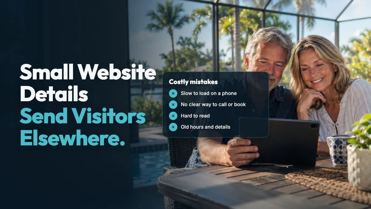
Seven website mistakes can make it harder for a Southwest Florida visitor to choose your business: a slow phone site, no clear call or booking option, hard-to-read text, difficult forms, buried services and location, missing contact details, and old information. Each one gives a person another reason to leave before they understand what you do.
Say you run a Fort Myers trade business and someone checks your site between jobs. They should be able to see your service, service area, phone number, and next step without hunting for them.
Why these website details matter in Southwest Florida
Your site is often read quickly, often on a phone. Researchers writing in ACM Transactions on the Web found that everyday web browsing is rapid, even on pages with substantial content, and concluded that pages should allow for cursory reading. Clear headings, short paragraphs, and obvious next steps respect that reality.
Phone use matters for search as well. Google says it uses the mobile version of a site's content for indexing and ranking, calling this mobile-first indexing. Google also says responsive web design is the easiest pattern to implement and maintain, and that your mobile and desktop sites should have the same content.
Southwest Florida also has a wide range of visitors. The U.S. Census Bureau estimates that people age 65 and over make up 29.2% of Lee County and 34.8% of Collier County. A site with tiny type, weak contrast, or confusing buttons can be difficult for many people to use, not just older visitors.
The seven mistakes and quick fixes
The site loads slowly on a phone
A visitor may be standing in a driveway, sitting in a parking lot, or looking for help at home. If the main content takes too long to appear, the site feels unfinished. Google's Core Web Vitals guidance says Largest Contentful Paint should occur within the first 2.5 seconds of a page starting to load for a good user experience. It also says interaction responsiveness should be less than 200 milliseconds and visual stability should score less than 0.1.
Quick fix: Open your homepage on your own phone using cellular service. Watch for oversized photos, shifting buttons, and anything that holds up the main service information.
There is no clear way to call or book
Someone who wants to reach you should not need to search through a menu or read several paragraphs first. A phone number tucked into a footer is easy to miss. The same goes for a booking option hidden on a contact page.
Quick fix: Put a clear call option and a clear booking or contact option near the top of key pages. Check that both work on a phone. Give people one simple next step at a time.
The text is hard to read or use
Small letters, low-contrast colors, color-only instructions, and forms that require a mouse can shut people out. The U.S. Department of Justice says an inaccessible website can exclude people much like steps at the entrance to a physical location. Its examples include poor contrast, images without text alternatives, inaccessible forms, videos without captions, and mouse-only navigation.
Quick fix: Use readable type, plain language, clear labels, and strong contrast. Do not rely on color alone to explain an error or a choice. Test the site with the text enlarged on a phone.
Forms are hard to finish
A form that asks for too much, has vague fields, or gives no useful error message can stop a person halfway through. In a controlled eye-tracking experiment with 65 participants, researchers at the ACM CHI conference found that improved forms were completed faster, needed fewer submission attempts and eye movements, and had higher reported satisfaction.
Quick fix: Ask only for what you need to start the conversation. Label every field clearly, make required fields obvious, and submit the form yourself from a phone.
Your pages bury what you do and where
A visitor should not have to guess whether you handle their kind of job or serve their town. Long introductions can push the useful answer too far down the page. This is especially important when someone is comparing a Cape Coral, North Fort Myers, Bonita Springs, or Naples option quickly.
Quick fix: Near the top of each main page, say what service you provide, who it is for, and the area you serve. Use plain service names your customers use when they call or text.
Contact details are missing or scattered
People want to know there is a real business behind the site and how to reach it. Stanford's Persuasive Technology Lab reports that people quickly judge a site by visual design alone, and that typos and broken links hurt credibility. Its guidance also advises making a phone number, physical address, and email clear where they apply.
Quick fix: Check your phone number, email, location, and service area on every important page. Make sure the number is tappable on a phone and that links do not lead to dead pages.
Hours and details are out of date
Old hours, a former service, or a disconnected number make a visitor pause. Seasonal changes, holiday hours, and a new service area are easy to overlook when you are busy running the business. Yet those are often the details someone needs before reaching out.
Quick fix: Set a recurring time each month to check hours, services, contact details, and booking availability. Keep the same information on your website and the public places where people find your business.
A practical check you can do this week
Use your phone, not just a desktop computer, and review your site as if you have never seen it before.
- Find the answer fast: Can you tell what the business does and where it works right away?
- Try the main action: Tap the phone number, booking option, and contact form.
- Read without strain: Enlarge the text and look for weak contrast or crowded sections.
- Check every detail: Confirm hours, service area, email, and phone number.
- Look for friction: Submit a test form and note every field or instruction that feels unclear.
- Check the basics: Look for broken links, old photos, and services you no longer offer.
- Ask one person: Have someone unfamiliar with the site find your contact details and describe your main service.
If the site does not make those tasks simple, start with the page most people see first. Small corrections there can make the whole site easier to use. For another useful check, read our article on what a website adds beyond Google reviews.
How Deja Vu Marketing can help
We build your website and the system behind it, so every caller gets a reply and can book anytime. Every plan includes online booking and instant replies to web requests. We also give you one free edit hour every month, so you have time to keep hours, services, and business details current. Your site gets a free refresh every three years. The goal is a clear website that helps people reach you and take the next step without getting lost.
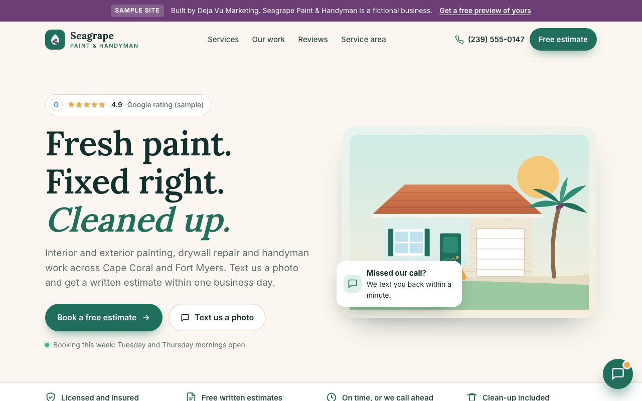
See your website before you decide anything
Book a free 15-minute call and ask for a free preview. We'll build a sample website from your public Google listing before we talk, so you can see what yours could look like. We meet in person anywhere from Cape Coral to Naples, and it's month-to-month, with no contract.
Book your free 15-minute call or call or text (239) 990-3072. Our AI assistant answers day or night.
Sources
- Google. (2025, December 10). Understanding Core Web Vitals and Google search results. Google Search Central. https://developers.google.com/search/docs/appearance/core-web-vitals
- Google. (2025, December 10). Mobile site and mobile-first indexing best practices. Google Search Central. https://developers.google.com/search/docs/crawling-indexing/mobile/mobile-sites-mobile-first-indexing
- U.S. Department of Justice, Civil Rights Division. (2022, March 18). Guidance on web accessibility and the ADA. ADA.gov. https://www.ada.gov/resources/web-guidance/
- U.S. Census Bureau. (n.d.). QuickFacts: Cape Coral city, Florida; Lee County, Florida; Collier County, Florida. Retrieved October 23, 2026, from https://www.census.gov/quickfacts/fact/table/capecoralcityflorida,leecountyflorida,colliercountyflorida/PST045225
- Seckler, M., Heinz, S., Bargas-Avila, J. A., Opwis, K., & Tuch, A. N. (2014). Designing usable web forms: Empirical evaluation of web form improvement guidelines. In Proceedings of the SIGCHI Conference on Human Factors in Computing Systems (pp. 1275–1284). ACM. https://doi.org/10.1145/2556288.2557265
- Weinreich, H., Obendorf, H., Herder, E., & Mayer, M. (2008). Not quite the average: An empirical study of Web use. ACM Transactions on the Web, 2(1), 1–31. https://doi.org/10.1145/1326561.1326566
- Fogg, B. J. (2002, May). Stanford guidelines for web credibility. A research summary from the Stanford Persuasive Technology Lab, Stanford University. https://credibility.stanford.edu/guidelines/index.html