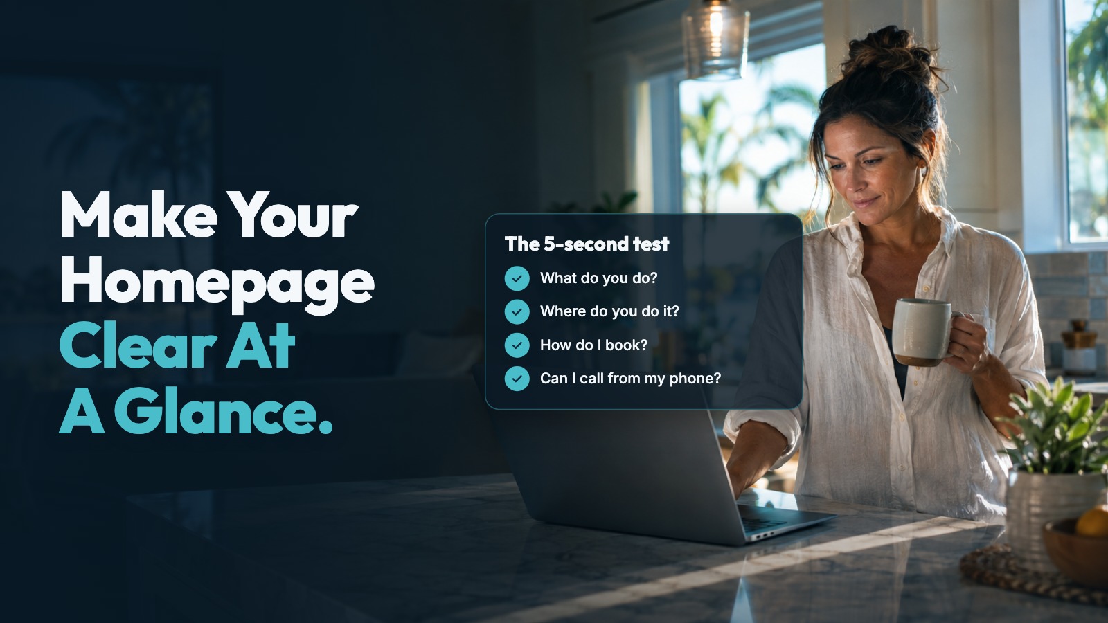
The 5-Second Test: Does Your Small Business Homepage Say What You Do?
Your homepage passes the five-second test if a stranger can tell what you do, where you work and how to book or call. If those answers take a scroll, a menu search or a guess, we recommend making them clearer before adding anything else.
Say you run a handyman business in Cape Coral. Open your website on your phone and look at it as someone with a damaged door would. Does it say you handle repairs in Cape Coral, or does it greet them with “Quality you can count on”?
The second line could belong to almost any business. Your customer shouldn't have to work out which kind you run.
Why a quick first impression matters
A study published in Behaviour & Information Technology found that people's ratings of a homepage's visual appeal after a 50-millisecond glimpse were highly correlated with their ratings after 500 milliseconds. The authors concluded that people can judge visual appeal within 50 milliseconds.
That's about appearance, not whether someone understood a service or decided to hire a business. We wouldn't use it to claim that a quick glance decides a sale. It does give us a reason to take the opening view seriously.
A separate study in the International Journal of Human-Computer Studies looked at visual complexity and how typical a website looked for its kind. Those qualities shaped judgments of appeal within 50 milliseconds, and even within 17 milliseconds. Overall, sites with low visual complexity and an expected look were seen as highly appealing.
That doesn't mean your site needs to look like every other contractor's site. Our advice is to keep familiar things easy to find: your service, your location, a booking button and your phone number. Let your work and your own photos give the page its character.
Keep the distinction clear: the research measures quick judgments of appearance. The five-second exercise below is a practical check for clarity, not a scientific prediction of whether someone will book.
Test your homepage and fix what's unclear this week
Start on your phone, without scrolling. Open the homepage, look for five seconds, then look away. Better still, ask someone who doesn't already know your business to try it. Don't explain the page before they look.
Ask what you do, where you do it and how they'd book. Then ask whether they noticed a way to call. Listen to their answers before showing them where everything is. If you have to point something out, you've found something worth checking.
Name the service and the town. Replace a broad welcome with a line that describes the work. “Handyman repairs in Cape Coral” gives a stranger something concrete. “Built around your needs” doesn't tell them whether you fix doors, clean pools or groom dogs.
Use the town or area you actually serve. If you work across several places, keep the headline readable and explain the service area just below it. Don't crowd the opening with a long string of town names.
Give the main button a clear job. Choose the next step that fits how you work. “Book a visit” is a direct label when the button opens your booking page. If the next step is a request rather than a confirmed appointment, label it “Request a visit” instead.
Keep other links available, but avoid giving every action equal weight. A visitor shouldn't have to compare “Get started,” “Learn more” and “Let's connect” to work out which one handles an appointment.
Use your own work photos. Choose a photo that helps explain the service rather than simply filling space. For a painter, that might be a finished room or careful trim work. For a handyman, it might be a completed repair.
Check how the photo crops on a phone. Keep the useful part visible, and don't place your service description over a busy area where it's hard to read. You can keep the headline beside or above the image instead.
Make the phone number tap to call. Display your business number as text and make it a working call link. Don't leave it only inside a photo or tucked into the bottom of a long page.
Test it on your own phone. Tap the number and check that it opens the correct call prompt. You don't need to complete the call to check the number shown. Also make sure your booking button opens the place its label describes.
Check the whole opening view again. After your edits, close the page and reopen it on your phone. Can you read the service, town and next step without opening a menu? Does a large photo push all the useful information out of view?
Remove anything that competes with those answers without helping explain your work. Repeat the short test with someone unfamiliar with the business. Ask what they understood, not whether they liked the design.
You don't have to rewrite the entire website to do this check. Start with the opening view, then make sure the next step works. For a broader review, we cover other practical checks in 7 Website Mistakes That Cost Southwest Florida Small Businesses Customers.
How Deja Vu Marketing can help
We build your website and the system behind it, so every caller gets a reply and can book anytime. Your website is on your own domain. We ask for your own work photos, along with your services, location and hours.
Every plan includes online booking and missed-call text-back from a local number. When you can't pick up, your business number texts the caller back within a minute with a link to book. You can keep your current number or forward missed calls to the new line.
The homepage gives people a clear place to start. Booking and missed-call text-back handle the next step when you're busy with the work.
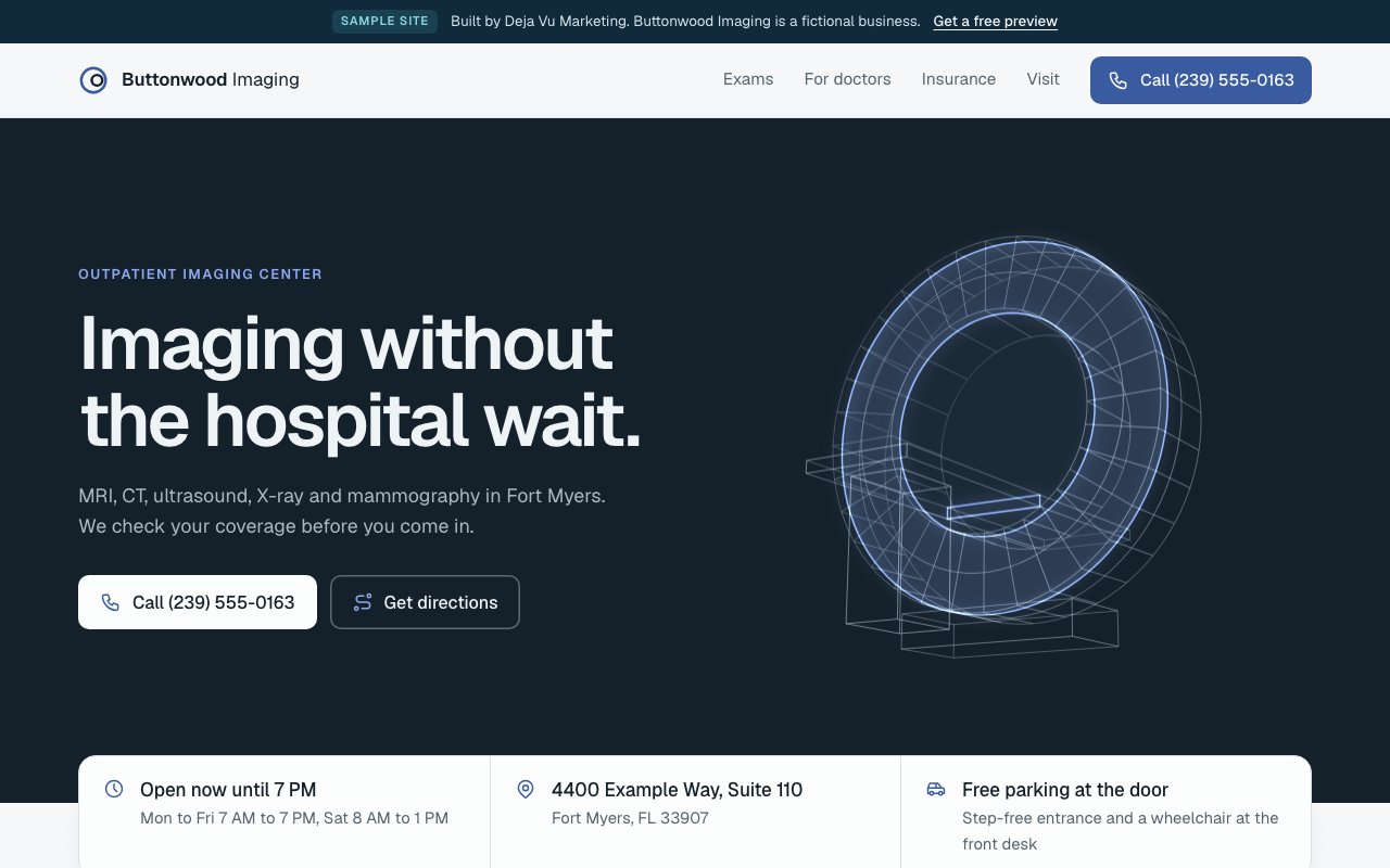
See your website before you decide anything
Book a free 15-minute call and ask for a free preview. We'll build a sample website from your public Google listing before we talk, so you can see what yours could look like. We meet in person anywhere from Cape Coral to Naples, and it's month-to-month, with no contract.
Book your free 15-minute call or call or text (239) 990-3072. Our AI assistant answers day or night.
Sources
- Lindgaard, G., Fernandes, G., Dudek, C., & Brown, J. (2006). Attention web designers: You have 50 milliseconds to make a good first impression! Behaviour & Information Technology, 25(2), 115–126. https://doi.org/10.1080/01449290500330448
- Tuch, A. N., Presslaber, E. E., Stöcklin, M., Opwis, K., & Bargas-Avila, J. A. (2012). The role of visual complexity and prototypicality regarding first impression of websites: Working towards understanding aesthetic judgments. International Journal of Human-Computer Studies, 70(11), 794–811. https://doi.org/10.1016/j.ijhcs.2012.06.003